Unfortunately, I think us Australians need to lift our game. New Zealand is smaller, and has more sheep than people, yet they're kicking our arses in the craft & design media realm.
World Sweet World is an awesome looking 'magazine for makers and doers', split between projects and features. Luckily for me (and you), they sell off their website.
Penny Stotter is my new oo-I-want artist. And her works are not unreasonable. Badly Coloured Boy's stepmother has offered to buy him a piece of art in honour of his graduating university, and he is a little confused about what he might like. It would be wrong to heavily steer him in the direction of something I rather want, wouldn't it?
And how did I find out about these Kiwi delights? Courtesy of my new favourite blog, Studio Home Creative. It's like Decor8, or DesignSponge, with a fresh antipodean twist. Can you believe the blogger is barely older than I am?
*sigh* I think it's time to start saving for a holiday with the rellies in Auckland.
Showing posts with label art. Show all posts
Showing posts with label art. Show all posts
Sunday, March 30, 2008

Thursday, February 28, 2008
Borrowed Light

I went to see Borrowed Light last night, as part of the Perth Festival. Three things in life and the arts that I do adore are sacred choral music; challenging dance styes; and austere theology (no, seriously). Borrowed Light, by the Tero Saarinen Dance Company, fit all three. Borrowed Light was an exploration of the Shaker beliefs and lifestyle. An early music ensemble, the Boston Camerata provide live vocal accompaniment in the form of Shaker music some of which has never been heard outside the Shaker community and even then not for 150 years. Imagine something between Gregorian chants and middle-English folk music (I tried so hard to find an audio clip, but nothing forthcoming). And imagine that the singers are on stage, moving through and with the dancers sometimes.

Saarinen draws heavily on Kabuki for his choereographic language, which I think explains the awkward angles, flat feet and splayed hands. It was difficult to settle into, especially given that the first five minutes or so are performed completely in silence. The dancing was heavy and awkward. I only noticed two jumps in the entire performance - the dancers always had one foot on the ground, unless another dancer was lifting them, which was never done gracefully or easily. They barely walked when they could hobble, or limp. Once you got accustomed to it it was stunningly beautiful. I've never seen so much emphasis placed on the mere movement of individual fingers. I also loved that in a virtually abstract environment I could still discern stories and themes - loss of faith; the outsider; a struggle for grace.

Not only that, but the dancers themselves provide what percussive accompaniment there is, stamping, clapping, and, at one point, throwing their entire body on the floor. Breathing, too, was sometimes audible (and I was in the back row of the stalls). Apparently the floor is miked, which makes sense.
The costumes were dark and heavy. The men's coats were entirely made of felt, and they obscured the body for the most part. The women's skirts were part weighted-down felt, part what seemed to be pleated silk. Their shoes were heavy. The lighting was often stark and directional, like sun rays falling through meeting hall windows.
It was just beautiful.
Friday, June 15, 2007
felt is made of wool and so is this:

ta-da. It's the fronts and sleeves of the arwen cardy. I have a back too, but I'm not 'wearing' it in that photo (in case you didn't work it out, I've just put the sleeves on, and draped the attached fronts in place). Only the hood to go, which won't be started till after i finish exams (Monday...). Don't click to enlarge, it'll be blurry. I took the photo in the bathroom mirror, and it doubles images slightly. Well, that's my excuse.
'What's that on her t-shirt?' you say. Well, maybe you don't, but I wish you would because I've been trying to figure out a reason to blog this for a while. It says "Joseph Beuys". Cool, huh? It's from a series of fan t-shirts made by... some artist made for Supermart '04 (click 'program', scroll down till you you find it).
Now, to Spidersknit's meme (though I note she hasn't photographed her pantry, so I'm not sure why I'm bothering *pointed look*). I also doubt how grown up I am.
I wish I had been when I grew up:
- Bilingual. Or trilingual. I'm so embarassed by my monolingualism when I travel. When my tour guide in Morocco speaks five language fluently, but can't afford an overseas trip, y'know? When every European waiter swaps in my language because I order my food in theirs, y'know?
- A curator. Preferably a textiles curator. Preferably at the Victoria & Albert Museum. While I may seem interested in sewing 'n stuff now, sit me down in front of Historical Fashion in Detail and watch me spazz out. I'm still a little bitter that there's nowhere in Perth to study fashion history (one uni teaches fashion design, and they offer one unit on 20th century fashion only). Obviously I got partway to this, what with the art history degree and all. But um, there are few jobs in Australia, the pay is astonishingly miserable, and I saw people studying around me with so much passion and no other alternative career they would consider, and I just thought that they deserved it more than I did. So I didn't do any post-grad. I'd kind of like to go back and do my arts honours one day.
- Able to stay up late at night and drink a lot. I'm the person that leaves parties before midnight because they're too tired, and ever since an awful incident involving a bottle of absinthe on New Years Eve 2003 I'm pretty much unable to drink anything at all without waking up feeling seedy. Oh, I'm well worth inviting to a party, me.
- A writer.
Thursday, June 07, 2007
Still Life with Owl and Grafted Cable
Alright, it's a pretty lousy shot, but in my defence it's overcast outside and a single energy-saver bulb lights the living room. And I have a rent inspection in half an hour, so I wasn't going to get too creative.

Owl is my Owl from Sugarloop. Framed in a cheapy Ikea frame. He lives propped against the wall on top of Badly Coloured Boy's chest of drawers, because the hook I bought to hang him off is too big to shove through the little picture hook hole on the frame clip. It's an awful photo. I promise he's amazingly crisp and detailed in real life, and I am quite the Sugarloop addict now (as is my mum. Every time I speak to her she manages to bring up how great my print is. I see a Christmas present coming on...)
The fabrics are my newest echino fabrics from Duckcloth. The green dots will pair with the Kristen Doran or the Lara Cameron to make a cushion. The other will be used up in the Placemat Campaign. I really, really love the deep red on natural colourway. It's sort of crisp and retro and rich at the same time.
And you're also looking at a completed left front/ left sleeve for the cardigan. Right side up is the point at which I kitchener stitched the cable together, and the entire sleeve. It isn't perfect, and blocking will help, but I think I did a pretty good job. The whole sleeve had a provisional cast on, because I hate picking up stitches. The instructions called for a regular cast on, then you picked up some ninety odd stitches and kitchener'd them. Figured I'd skip the picking up bit.
There may well be silence blog-wise for a little bit. I'm on study break right now and, lo and behold, am actually studying. Turning off the router during business hours does wonders for my productivity.
Oh, and I'm on Ravelery now. Same username as ever. No pictures yet, as I don't actually have a Flickr account, and the thing is set up to take images from Flickr.

Owl is my Owl from Sugarloop. Framed in a cheapy Ikea frame. He lives propped against the wall on top of Badly Coloured Boy's chest of drawers, because the hook I bought to hang him off is too big to shove through the little picture hook hole on the frame clip. It's an awful photo. I promise he's amazingly crisp and detailed in real life, and I am quite the Sugarloop addict now (as is my mum. Every time I speak to her she manages to bring up how great my print is. I see a Christmas present coming on...)
The fabrics are my newest echino fabrics from Duckcloth. The green dots will pair with the Kristen Doran or the Lara Cameron to make a cushion. The other will be used up in the Placemat Campaign. I really, really love the deep red on natural colourway. It's sort of crisp and retro and rich at the same time.
And you're also looking at a completed left front/ left sleeve for the cardigan. Right side up is the point at which I kitchener stitched the cable together, and the entire sleeve. It isn't perfect, and blocking will help, but I think I did a pretty good job. The whole sleeve had a provisional cast on, because I hate picking up stitches. The instructions called for a regular cast on, then you picked up some ninety odd stitches and kitchener'd them. Figured I'd skip the picking up bit.
There may well be silence blog-wise for a little bit. I'm on study break right now and, lo and behold, am actually studying. Turning off the router during business hours does wonders for my productivity.
Oh, and I'm on Ravelery now. Same username as ever. No pictures yet, as I don't actually have a Flickr account, and the thing is set up to take images from Flickr.
Friday, June 01, 2007
Knitting and Video Art
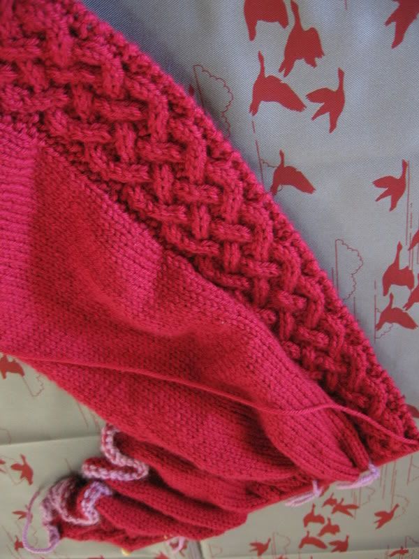
Here is Arwen, blocking the migratory path hundreds of Lara Cameron geese. I'm more than halfway through the sleeve now, which feels nice. I've cast off the shoulder bit (the part of the front that becomes the hood is still live, then the shoulder is cast off, then the sleeve is still being knit. Weird, eh?) I think I'm going to put together a tute on fixing complex cables, as I've done nine in total now, and feel quite the expert. Contrary to what other tutes say, you don't need to drop both cables down to where they cross. Dropping one works plenty fine.
Now, for an aside. See, thing is, a bunch of units on postmodernism down and I still have trouble with video art. I just don't like it. There is an awful lot of bad video art around, and bad video art is worse than bad still art, because bad video art makes you keep watching in the hope that it will somehow turn good. The Histrionics (or here) wrote a painfully apt satire called 'Video Art', to the tune of Horror Movie. The chorus ran 'Video art, right there on the TV... and it's boring me right out of my brain.'
The worst piece of art I ever saw in a gallery was an array of of broken pallets scattered on the floor, with two TVs on top of two pallets. One TV played a loop of a shot of an empty road in the desert, the other played a loop of the artist dressed as a scarecrow dancing awkwardly in front of a bluescreen to the tune of 'If Only I Had A Brain', from the The Wizard of Oz. Short of unkind remarks about the aptness of the song, I honestly have no idea what the artist was exploring, or trying to communicate to me.
Anyway, my point is that this video (beware! movie with sound load automatically!) is what makes video art worthwhile. I don't particularly care for the song (should I know the band? Blonde Redhead?), but the clip. It's beautiful. I think it's about limitations and possibilities. It works with the limitations and possibilities of film to create the work. Just when you think you can predict the next pose, the director snatches away to something else. It explores the limitations and possibilities of the human body. It's both static and dynamic. It's aesthetically interesting and attractive. It's imperfect - the artist shakes - just like us. I adore it.
Friday, May 25, 2007
Owl!
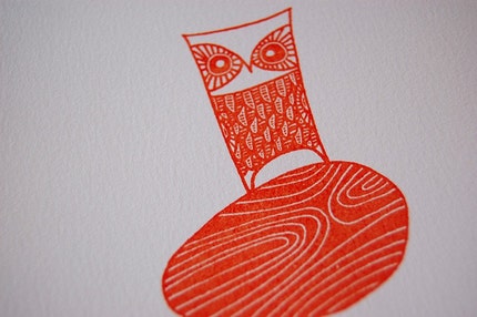
Isn't he lovely? I just bought this from Sugarloop's etsy shop. She really is one of my favourite Etsy sellers (for two reasons, one we're about to get to, the other because of her artwork). Oh, and the price! This came in at the ridiculous price of $20 Australian icluding shipping! Not that I'm complaining about a bargain. I kept umm-ing and ahh-ing over which of her prints to buy, then the one I liked would sell out, so when this one was listed this morning I didn't hesitate over the fact that nothing else in my house was orange, I snapped it up for its fab design. And given the size, I think it will fit into those delightfully low-price Ikea frames that are designed to hold Ikea postcards.
Now, the other reason I like Sugarloop's Etsy shop is to do with 'prints'. Many artists on Etsy sell 'prints'. Unfortunately, from a fine art perspective, what they actually sell is reproductions - a high quality copy (scanned and colour-printed, generally) of an original of their artwork, made in an unlimited/ unnumbered quantity*, sometimes signed. A print, technically, is a piece of art produced in a limited edition multiple, numbered and signed. There's nothing wrong with selling reproductions, but it makes it nearly impossible for those looking for prints to find them, short of searching individually for 'etching', 'linocut', 'gocco', 'screenprint', etc. I was lucky to stumble across Sugarloop.
I wish the terminology on Etsy was more precise, so as to separate out original artworks (prints) from the reproductions.
And many of the artists selling prints made from more accessible methods (gocco, screenprint, photography) don't number their work. I think this is a pity, as it prevents the work being regarded as 'real', collectable art in the traditional sense. When I print-made (what an excellent past-tense) my teacher used to make me destroy the plates/ screens after I completed an edition. And I was just a nobody churning out art to get a grade. He said it was a good habit to get into (and as a printmaker himself, I guess he would know). I personally won't buy a print that isn't numbered. I want to know how many other out there will have a piece of art like mine. Judging by Sugarloop's sucess, limiting the number of prints you make doesn't hurt business. She sells in sets of 80 to 100, generally, but there's no reason that editions can't be bigger. I have other etchings that are from editions of 500 and 1500 respectively. And you don't actually have to make all 1500 in one go. It's just a commitment that you won't make more than that number. And small alterations (hand-colouring part; or changing the ink colour) can justify a new edition.
Perhaps that's old fashioned of me, expecting editions to be limited. Are there other perspectives that defend not numbering works?
* Some reproductions are sold in limited editions too, actually. Banksy, for instance, sells limited edition reproductions (in the form of posters) that fetch high prices. Jury's out on this for me. I have no problem with the practice of selling limited edition repros, but I don't think I'll ever buy one personally. Maybe I'm just an art snob.
Friday, April 20, 2007
bits & pieces
there's been no real progress on the knitting front, i'm afraid. too busy. i have managed to bite my nails to pinkish shreds (i'm so good at externalising stress), but you don't want to see that. i showed my friend, and he gasped and made little wincing faces.
instead, i'm going to show you all some Cool Stuff (TM) that ive found recently.

this is a detail from 'Tokyo Winters', a screenprint by Brooke Bobridge. i don't normally do cute, girly art (spending much of one's major analysing Interior Scroll will do that to a girl), but this i could hang on my wall. or any of bobridge's prints, actually. they're a mere $60, signed and numbered, and for sale at Keith & Lottie.
also at Keith & Lottie is this most fabulous t-shirt, by australian designer Princess Tina/ Beci Orpin.

i do not have $69 to spend on a t-shirt right now. if anyone does, please, feel free to purchase it for me. i'd be a medium. and also yours for life.
instead, i'm going to show you all some Cool Stuff (TM) that ive found recently.
this is a detail from 'Tokyo Winters', a screenprint by Brooke Bobridge. i don't normally do cute, girly art (spending much of one's major analysing Interior Scroll will do that to a girl), but this i could hang on my wall. or any of bobridge's prints, actually. they're a mere $60, signed and numbered, and for sale at Keith & Lottie.
also at Keith & Lottie is this most fabulous t-shirt, by australian designer Princess Tina/ Beci Orpin.
i do not have $69 to spend on a t-shirt right now. if anyone does, please, feel free to purchase it for me. i'd be a medium. and also yours for life.
Tuesday, March 27, 2007
i think i'm craving plum.

isn't this beautiful? it's After the Fire - Leaf Surge, by John Wolseley. i'd give an awful lot to be able to hang it above my desk. Wolseley was one of my influences in high school (the art curriculum forces students to nominate official influences), for my most favourite print that i turned out. maybe i'll post a picture of it sometime. i periodically forget that Wolseley exists, then about six months ago i heard him interviewed on the radio. and tonight he's hosting an art program, which made me seek him out again.
myself? i've discovered i've moved on a little from the red/ pink/ blue combination that's dominated by colour choices over the past year. unconsciously, recently, it seems i've been a little bit obsessed with purple.

swatch and yarn for mystery project, fabric for dress lining, and merino for some endpaper mitts.
Monday, March 12, 2007
on sewing and feminist art
my ribbon arrived a little while back.

isn't it fabulous? far nicer in real life than the website indicated. the little diagrams reminded me of the hands in this artwork by Barbara Kruger. I wonder what Ms Kruger would think of my associating her work with the domestic, feminine sphere?

i remember finding this work in an anthology of feminist art writing editing by Lucy Lippard and just being floored by it. i love the force of the hands in 'will'. look at how the man is the one with the power to see (the effect of this is weakened by using a gender-indeterminate person for 'heard'). though these days i wonder if it doesn't say more about the disabled than women? also its implicit insistence on strictly dichotomous gender doesn't really leave much room transgender people/ transexuals.
god, you know what i'd love to do? print each of these images (that's actually nine separate artworks in a series) onto iron on transfer paper, transfer them to fabric, stitch them together and make a patchwork cushion.
the irony would kill me. me and all my fine-arts friends.

isn't it fabulous? far nicer in real life than the website indicated. the little diagrams reminded me of the hands in this artwork by Barbara Kruger. I wonder what Ms Kruger would think of my associating her work with the domestic, feminine sphere?
i remember finding this work in an anthology of feminist art writing editing by Lucy Lippard and just being floored by it. i love the force of the hands in 'will'. look at how the man is the one with the power to see (the effect of this is weakened by using a gender-indeterminate person for 'heard'). though these days i wonder if it doesn't say more about the disabled than women? also its implicit insistence on strictly dichotomous gender doesn't really leave much room transgender people/ transexuals.
god, you know what i'd love to do? print each of these images (that's actually nine separate artworks in a series) onto iron on transfer paper, transfer them to fabric, stitch them together and make a patchwork cushion.
the irony would kill me. me and all my fine-arts friends.
Subscribe to:
Posts (Atom)